Hotel corridors are often the busiest and most used part of a hotel. They need to be attractive, but at the same time, they also have to be sturdy and well built.
They are constantly being hammered down by luggage trolleys and food carts. It should be well lighted, comfortable and should be able to put the customers at ease.
Find these 18 Nice Hotel Corridor Designs as below:
1. Writing On The Floor
 The interesting floor inscription breaks the monotony of the long floor. That coupled with the bright red colour wall adds to the sense of mystique in this corridor. The small sitting arrangements, contrast colour cushions and the bright lighting add a sense of warmth to the whole set-up.
2. Lighting Innovation Corridor

Corridors are often very long and boring. Any innovation that can help break the monotony adds a sense of excitement. This type of zig-zag fashion created by the lights adds character and provide lighting to the long corridor.
3. Patterned Floors CorridorRenovation

Continuous patterns on the floor go a long way in creating interesting and attention-grabbing corridors. Moreover, these are extremely practical and effective option for the corridor floors. It eases out the cleaning process and reduces maintenance cost.
4. Light & Perception Corridor

If you ever considered a low-cost option to brighten up a long boring corridor, this is the best bet. It is a low cost and practical solution to add some spark and jazz to a long boring corridor. The best thing is you don’t need to invest too much time in setting this up.
5.Warm & Cozy Corridor

It is indeed interesting how wood and light can partner to exude absolute warmth. If you want the corridors to exude the essence of hospitality, look at pairing warm yellow lights and dark wooden panels. You can add a few more variation like interesting write-ups on the door rooms and create attention-grabbing patterns there.
6. Combining Contrast Colors Corridor

Colors have a very lucid way of communicating. A bright hue paired with a note creates a heady medley. The little pockets of brightness break the monotony and lend warmth to the whole area.
7. Stylishly Steel Corridor

If you want to go for the minimalist yet classy look, this is undeniably one of the best hotel corridor designs. It is subtle and without too many elements. The bright light reflects on the silver finish creating a pattern on its own.
8. Floor Carpets Corridor
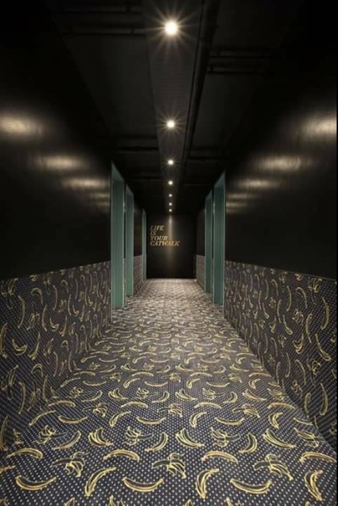
However, if the overall décor in your hotel necessitates the carpet in the corridor, this is a great option. The cover extends till half the wall. This is crucial as it satisfies both design aesthetics and also the overall functionality.
9. Continuous Stone Patterns Corridor
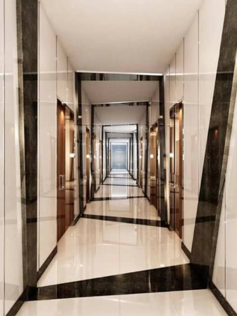
This is the perfect option for really long corridor walls. It is extremely functional too. These can be created along with the corridor floor, and you do not have to invest time in designing the walls separately. It also lends continuity to the overall theme. You can also add some small figurines and console tables to add to the overall décor.
10. Colors & Contrast Corridor

A simple and nice floor covering can also grab attention with just a dash of colour and an asymmetric design. Simple, classy and understated is how you will describe this hotel corridor.
11. Modern Magic Corridor

Did you ever think that just by colouring part of the walls in the contrasting shade you can create magic in your hotel corridor? Well, if you had not thought about it, it is time to be stunned by this magic of bright yellow paired with nice grey walls.
12. The Golden Glow Corridor
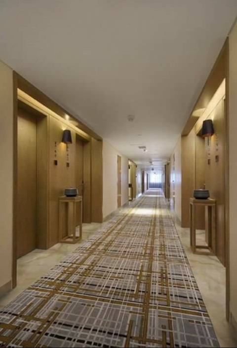
Gold has a very special place in Malaysian culture. This hotel corridor marries these traditional aesthetics with modern design trends to create a stunning look. This corridor looks spacious and beautifully done-up. The little touches on the corner table, the interesting floor cover add to the style.
13. Play on The Depth Corridor

Corridors are notorious for being long and boring. But what if you used this length to your advantage? Create a visual illusion like this and play on the depth for best results.
14. Minimalist But Striking Corridor
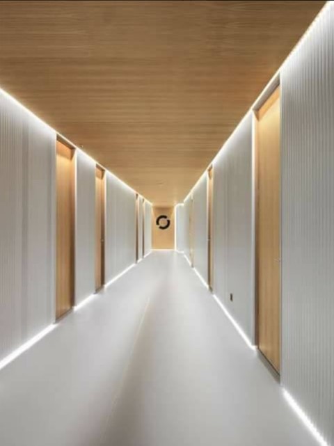
A minimalist look doesn’t always have to be in white or grey. Using contrasting shades of gold and off-white, this one creates a sense of intrigue and mystique through the corridor.
15. Go Green Corridor

A little stretch of greenery can spin magic even in the most boring locales. So if you want to add life and interesting elements to your corridor, a green stretch is the best bet. It is low cost, trendy and simple to maintain.
16. Light Your Way Corridor

Ever thought about the way you can use light in a corridor? Well, the trick is to run your imagination wild and invest in some good quality fixtures. The results can be as stunning as this one.
17. Concept Conundrum Corridor

If you ever heard about concept designing, it is time to see the results now. It could be a boring corridor leading to the washroom. But with little imagination and innovation and sheer placement of lights creates an element on drama on the walls.
18. Tackle Claustrophobia Corridor
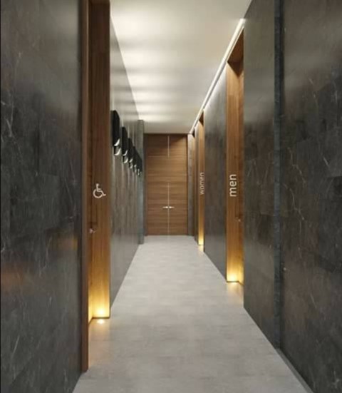
Corridors are inevitably narrow and claustrophobic like this one. However, with proper placement of light and interesting fixtures, you can turn it into a work of art. The way the men and women signs are written adds more character.
Conclusion
Great hotel corridor designs are all about marrying convenience, style and functionality. You can often get stunning and quality designs at very limited cost and in sync with the overall style.
You Might Also Like:
1) 21 Creative Kitchen Cabinets
2) 19 Amazing Tiles Designs
3) 19 Stunning Transparent Glass Flooring Designs


